The Iconic History and Design Evolution of U.S. National Park Entrance Signs
Article Editorial Team
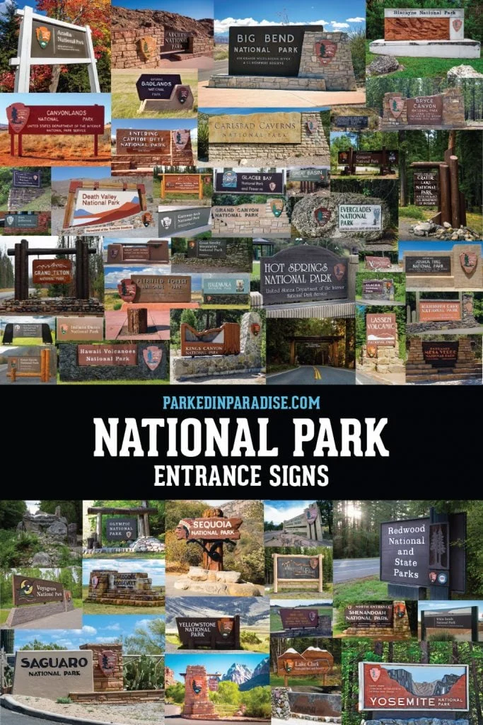
What better way to memorialize a journey across the American landscape than pausing to snap a photograph in front of an iconic National Park entrance sign? For millions of tourists and outdoor enthusiasts each year, these rustic markers serve as both a welcome to untamed wilderness and definitive proof of presence. Yet, behind every weathered wooden plank, carved block of stone, and cast-bronze emblem lies a fascinating history of design, bureaucratic debate, and deliberate landscape integration that has evolved over nearly a century.

Each National Park boasts a unique entrance sign acting as a hot spot for travelers eager to capture a piece of their adventure. While visitors frequently admire the aesthetics of these gateways, the story of National Park signage encompasses much more than just a place to pose. From the strict standardization of typography and color palettes to the fierce debates over local identity versus unified system branding, the visual identity of the National Park Service tells a rich story of American public lands management.

National Park Arrowhead Icon History
One visual element that immediately catches the eye at nearly every park boundary is the iconic National Park arrowhead. The famous emblem features a striking composition incorporating a sequoia tree, towering mountains, and a grazing bison, capturing the quintessential elements of America’s diverse natural heritage. This historic patch was originally designed by Dr. Aubrey Neasham in 1951 to establish a recognizable symbol for the bureau. Since its inception, the distinctive arrowhead has been prominently displayed on park entrance signs, uniforms, and official publications.

Over the decades, the logo has gone through several iterations to modernize its lines and adapt to changing media. The current version of the arrowhead logo was redesigned and updated in 2000 by the Dennis-Konetzka Design Group out of Washington, D.C., ensuring the emblem remained crisp, legible, and structurally balanced for contemporary signage standards.

What Fonts Are Used In National Park Signs?
The push for visual consistency across hundreds of disparate federal properties led to significant changes in typography over the years. In 2000, the National Park Service hired Don Meeker & Associates to formulate an official style guide for the agency. The design group was selected to standardize park signage and visitor information systems, which included a comprehensive overhaul of typefaces used on all official communications.

Designer James Montalbano was ultimately chosen to select fonts that would maximize readability for drivers and pedestrians navigating the parks. Currently, the two official National Park typefaces are Rawlinson, a traditional serif font, and Frutiger, a clean sans-serif typeface.

Prior to 1990, the official National Park Service font was Clarendon, a bold serif option that graced many older markers. Going back even further, the historical landscape looked vastly different. Before 1968, individual parks enjoyed complete autonomy regarding their visual presentation, meaning park superintendents were free to choose whichever fonts and colors they felt best suited their local environment without centralized interference.

National Park Service Colors
To maintain a cohesive visual identity, the National Park Service established a rigid palette of official Pantone colors used on the Arrowhead artwork and general park signage. This standardized color scheme ensures that whether a traveler is visiting a humid southern swamp or an alpine peak in the Pacific Northwest, the foundational branding of the federal agency remains instantly recognizable.

Why Are National Park Entrance Signs Different?
Despite decades of centralized planning, park entrance signs have perpetually sparked debate within the National Park Service. A fundamental philosophical split exists among conservationists, park administrators, and designers regarding how these gateways should look.

One faction believes that all official signage should maintain a uniform, consistent appearance to symbolize the cohesive nature of the National Park System as a single, unified entity. Proponents of this view argue that standardization reinforces the authority and institutional identity of the National Park Service.

Conversely, preservationists and park traditionalists argue that modern, mass-produced materials and overly uniform designs detract from each park’s distinct personality and ecological setting. They contend that a desert monument requires a vastly different visual approach than a coastal marine sanctuary or a dense eastern forest.

Entrance Signs For Each US National Park
To reconcile these competing philosophies, the National Park Service ultimately established a middle ground. Current guidelines dictate that each park entrance sign must incorporate the official Arrowhead logo along with the standardized Rawlinson and Frutiger typefaces. However, to preserve local character, support panels and surrounding structures should be sourced from indigenous materials that complement the native landscape.

Even with these codified standards in place, a journey across the American park system reveals that not all National Parks have adapted their entrance signs to meet the modern framework, preserving instead a patchwork of historical aesthetics.

At Acadia National Park in Maine, visitors are greeted by an entrance marker that serves as an exemplary model of the current NPS style guide. It cleanly implements the standard Rawlinson and Frutiger typefaces alongside the official Arrowhead design, blending smoothly into the surrounding coastal woodlands.

Other locations have embraced the mandate to source local materials for structural support. At Arches National Park in Utah, the entrance marker is expertly built directly into native stone, anchoring the signage firmly into the surrounding arid landscape to complement the dramatic red-rock terrain.

In contrast, Badlands National Park in South Dakota maintains an older aesthetic, having yet to update its lettering to reflect the contemporary park service style guide. This vintage presentation harkens back to the era prior to 1968, when individual parks exercised total freedom in choosing their own fonts and color schemes.

Similar divergence can be seen at Black Canyon of the Gunnison National Park in Colorado. The park does not follow the updated typefaces mandated by the modern National Park System. However, it successfully utilizes local materials for its structural base and features a striking graphic representation of the park’s famous Painted Wall, highlighting the geological drama found within the gorge.

At Death Valley National Park, stretching across California and Nevada, the welcoming marker captures the sweeping scale of the mountains and valley while offering a subtle preview of Badwater Basin. Notably, this signage bypasses current park typefaces entirely, instead utilizing Helvetica—a clean typeface first introduced to the park service in 1977 by renowned designer Massimo Vignelli.

Further north, the entrance to Glacier National Park in Montana utilizes an older typeface that has since been retired from contemporary use, offering visitors a nostalgic glimpse into past decades of park administration.

Down in California, the approach to Sequoia National Park introduces travelers to a truly historic piece of craftsmanship that looks entirely unlike standard park signage. Greeting visitors without the iconic arrowhead or the official modern typefaces, this sign was designed in 1935 by George Muno, a craftsman working with the Civilian Conservation Corps. The marker features the distinctive Native American profile originally struck on the 1913 "buffalo" nickel. This imagery was chosen to honor Sequoyah, the celebrated Cherokee scholar who independently created a syllabary for his native language—a historical figure widely believed to be the namesake of the towering sequoia trees.

From the volcanic peaks of Lassen Volcanic and Hawaii Volcanoes to the rugged coastlines of Olympic and the vast expanse of Yellowstone, the entrance signs guarding America’s protected lands continue to serve as vital cultural artifacts. Balancing institutional identity with regional individuality, these wooden, stone, and metal markers remain enduring symbols of the nation’s natural heritage.
Related News