The History and Evolution of America’s Iconic National Park Entrance Signs
Article Editorial Team
What better way to memorialize a road trip through America’s public lands than to pull over, step out of the vehicle, and snap a photograph directly in front of the iconic entrance sign? For millions of visitors each year, these rustic wooden or carved stone markers serve as the ultimate badge of honor, proving presence and kicking off outdoor adventures.

While travelers often focus on the sweeping vistas, towering peaks, and winding trails that lie beyond the threshold, the physical signs themselves carry a rich design history, a strict typography standard, and an ongoing debate over standardization versus local identity. Across the United States, each National Park features a unique entrance sign, yet all of them share a deeply rooted heritage connected to the visual identity of the National Park Service.

National Park Arrowhead Icon History
One visual element that visitors will quickly notice at nearly every park boundary is the iconic National Park arrowhead emblem. This famous logo features a sequoia tree representing forests, mountains representing wilderness, and a bison representing wildlife. The patch was originally designed by Dr. Aubrey Neasham in 1951 to establish a unified visual identity for the bureau. Since then, it has been prominently displayed on park entrance signs, visitor guides, uniforms, and official publications.

Over the decades, the logo has gone through several stylistic iterations to modernize its appearance while retaining its core symbolism. The current version of the arrowhead logo was officially re-iterated in the year 2000 by the Dennis-Konetzka Design Group out of Washington, DC, ensuring sharp legibility across various mediums and scales.

What Fonts Are Used In National Park Signs?
The modern consistency seen in many park graphics stems from a deliberate effort at the turn of the century. In 2000, the National Park Service hired Don Meeker & Associates to create an official style guide for the entire park service. The group was selected to standardize park signage and visitor information, which included establishing a unified family of typefaces.

Designer James Montalbano was ultimately chosen to select fonts that would be exceptionally clear and easy for motorists to read at a glance. Currently, the two official National Park fonts are Rawlinson, a serif typeface, and Frutiger, a sans-serif typeface.

Prior to 1990, the official National Park Service font was Clarendon, another serif option. However, looking further back into the history of America’s public lands, a standardized look was not always the priority. Before 1968, individual parks were completely free to choose whichever fonts and colors they wanted, leading to a wildly diverse array of hand-painted and locally carved designs that reflected regional tastes rather than federal uniformity.

National Park Service Colors and the Debate Over Standardization
The official National Park Service Pantone colors used on the Arrowhead artwork displayed across park signage are carefully regulated to maintain visual harmony across the system. Yet, the implementation of these standards has sparked a long-running internal debate within the National Park Service.

Park entrance signs have historically been a source of passionate discussion regarding preservation and identity. Some administrators and designers believe that all park signage should maintain a consistent, polished look to symbolize the unified strength and collective prestige of the National Park System. Others argue just as strongly that modern, standardized materials and corporate fonts take away from each park’s distinct personality and historical integrity.

Ultimately, a compromise was struck. The NPS decided that modern park entrance signs should incorporate the standard Arrowhead logo alongside the Rawlinson and Frutiger typefaces, while support panels and foundational structures should be locally sourced from materials native to the region, such as native stone or local timber. However, as visitors travel the country, they quickly discover that not all National Parks have adapted their entrance signs to meet these federal guidelines, with many choosing to preserve older, locally crafted aesthetics.

Entrance Signs For Each US National Park
The vast diversity of America’s landscapes is mirrored in the physical structures greeting travelers at the borders of individual parks.

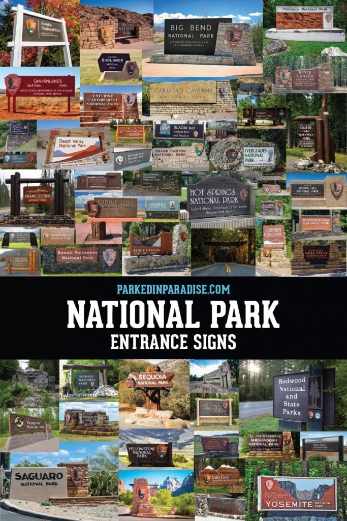
The entrance sign to Acadia National Park in Maine stands as a pristine example of the current NPS style guide in action, utilizing the standard Rawlinson and Frutiger typefaces alongside the official Arrowhead design. Similarly, parks like Arches National Park in Utah have integrated their signage directly into native stone to complement the surrounding desert landscape.

Other locations tell a different design story by retaining historical elements. Badlands National Park in South Dakota has yet to update its fonts to reflect the current park service style guide, preserving an older look that harkens back to the era before 1968 when parks operated independently.

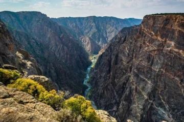
In Colorado, Black Canyon of the Gunnison National Park also diverges from the updated typefaces set forth by the national system. Its entrance sign utilizes local structural materials and features a distinctive graphic representing the park’s famous "Painted Wall."

Further west, Death Valley National Park—spanning California and Nevada—displays an entrance that captures the mountains and valley while providing a glimpse of Badwater Basin. Rather than using the contemporary park typefaces, Death Valley’s signage features Helvetica, which was first introduced to the park service in 1977 by renowned designer Massimo Vignelli.

Glacier National Park in Montana utilizes an older typeface that has since been retired from contemporary use, maintaining a classic aesthetic for visitors entering the rocky northern terrain.

One of the most historically significant markers in the entire system sits at the gateway to Sequoia National Park in California. When driving into the park, travelers are greeted by historic signage that bears no resemblance to standard modern park markers. It lacks both the iconic arrowhead and the official federal typefaces.

This unique monument was designed in 1935 by Civilian Conservation Corps craftsman George Muno. It features the exact same Native American profile found on the vintage "buffalo" nickel minted in 1913. The imagery was chosen to honor Sequoyah, a renowned Cherokee scholar who independently invented a syllabary for his native language—the historical figure for whom the majestic sequoia trees were widely believed to be named.

Other renowned locations like Yosemite National Park display structural elements that highlight the dramatic rock faces, waterfalls, and iconic landmarks such as Half Dome, while parks like Zion National Park in Utah continue to showcase older signage styles built from natural materials and retired lettering.

From the volcanic slopes of Hawaii Volcanoes to the rugged fjords of Kenai in Alaska, these markers remain vital touchstones for travelers, chronicling decades of design philosophy, regional craftsmanship, and the evolving identity of America’s protected lands.
Related News